The option chain is a table, and a table makes you hunt. To find the strikes that matter you scan a column of numbers, compare them in your head and try to remember which was biggest. An open interest chart does that work for you. It draws call open interest and put open interest as bars at every strike, so the heavy strikes stand out as tall bars, the gaps stand out as short ones, and the shape of the whole ladder is visible in one look. This guide explains how to read an open interest chart, what the tall bars mean, why today’s change matters more than the standing total, and how replaying the session turns a static picture into a story.
What an open interest chart shows
One pair of bars per strike: the call open interest on one side, the put open interest on the other, across the range of strikes you choose. Spot is marked so you can see which bars sit above the index and which below. That is the whole chart, and the reason it works is that open interest is very unevenly distributed. A handful of strikes carry most of the contracts, usually round numbers and the strikes just either side of spot, and those are the ones whose bars tower over the rest. The NSE publishes the same strike-wise totals as a table on its option chain page; the chart is that table with the hunting removed.
If open interest itself is new to you, start with the beginner’s guide to open interest; the chart assumes you know that a contract stays open until it is closed or expires.
The tall bars are the walls
Writers, not buyers, hold most index option open interest, and writers at a heavily written strike lose money if the index moves through it. So they defend it: as price approaches, they hedge in the direction that resists the move. That hedging is real order flow concentrated at one price, which is why the tall bars often behave as levels. Heavy call open interest above spot tends to act as resistance; heavy put open interest below spot tends to act as support. The mechanism is described in the guide to open interest support and resistance, and it is worth remembering that it is a tendency created by hedging, not a guarantee. Walls get broken, and when they do the move is often fast, because the same hedging flips direction.
On an open interest chart the walls are simply the tallest bars: the tallest put bar below spot and the tallest call bar above it. Between them is the range the writers are betting on.
The change overlay: defended or abandoned?
A standing total tells you where positions have accumulated. Today’s change tells you whether that wall is being reinforced or dismantled, and the second question is the one that decides whether the level still works. That is why the chart shades today’s increase or decrease on top of each bar. A wall that is still growing is being defended; writers are adding to it as price approaches. A wall that is shrinking is being abandoned, and a level being abandoned stops being a level before the total looks any different. Read the total first to find the walls, then the change to see which of them are alive. The four combinations of price and open interest change, the build-ups and unwinds, are set out in the OI buildup guide.
Cumulative and individual
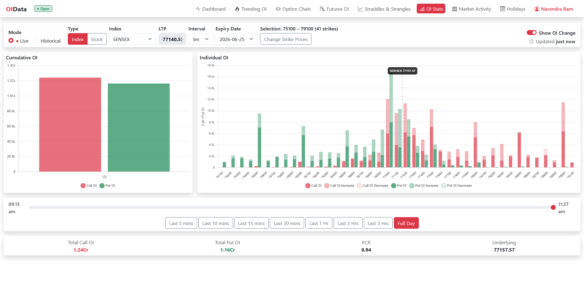
A second, smaller chart usually sits beside the ladder: total call open interest against total put open interest across the strikes you selected, two bars. That is the session’s overall lean, and dividing one by the other gives the put-call ratio for the range. When puts outweigh calls the range is supported on balance; when calls outweigh puts it is capped. The individual chart tells you where; the cumulative pair tells you how much.
The time slider: watching walls move
The closing shape of an open interest chart is one photograph. The session is a film, and the most informative moments are usually in the middle of it: a call wall that relocated one strike higher at 11:30, a put wall that was built from nothing in the last hour, a wall that was tall at noon and gone by two. A time slider replays the session so you can watch those things happen. Two reads follow from it. A wall that has been in place all day and grew as price tested it is a wall people are committed to. A wall that appeared in one burst may leave the way it came. The chain cannot tell these apart; the replay can.
A worked reading
In the figure the index is at 24,080 and the ladder runs from 23,100 to 25,100. Below spot the tallest green bar is the 24,000 put, a little under 1.7 crore contracts; that is the floor the writers are defending. Above spot the tallest red bars are the 24,500 and 24,300 calls, the first of them close to 1.7 crore as well. The index is sitting between a put wall and a pair of call walls. The cumulative pair on the left shows total call open interest of 17.01 crore against 13.80 crore of puts, a put-call ratio of 0.81, so the range as a whole is capped rather than supported. That is the whole reading in three glances: a floor at 24,000, ceilings at 24,300 and 24,500, and a book that leans towards the sellers of calls.
Stocks and indices
The open interest chart works for any F&O stock as well as the indices, with one difference. A stock has fewer strikes and wider spacing, so the ladder is coarser and one strike unwinding can reshape it more dramatically than on an index. Indices with heavy monthly books, BANKNIFTY in particular, change shape slowly; weekly index expiries change shape within a session. Read the stock chart with a little more caution about single-bar swings.
Where to see it
The OI Stats page draws exactly this: the cumulative pair and the per-strike ladder for any index or F&O stock and expiry, with the change overlay switched on or off, the strike range of your choosing, and a time slider that replays the session from 09:15 in Live mode, with quick ranges from the last five minutes to the full day. Historical mode replays any recorded session. Open interest shows in contracts or lots, and the totals, put-call ratio and spot sit underneath. The chart updates through market hours and replays any recorded session after the close.
Open interest chart FAQ
What is an open interest chart? A bar chart of call and put open interest at every strike of one expiry, with spot marked, so the heavily written strikes are visible as tall bars.
How do I find support and resistance on it? The tallest put bar below spot is the likely support and the tallest call bar above spot the likely resistance. Check the change overlay to see whether each wall is still being added to.
Should I read the total or the change? Both, in that order. The total shows where positions have accumulated and the change shows whether the wall is being reinforced or dismantled today.
Does it work for stock options? Yes, with fewer strikes and wider spacing, so a single strike unwinding moves the picture more.
Takeaways
- An open interest chart turns the chain’s column of numbers into a shape, and the tall bars are the walls.
- Heavy call open interest above spot resists; heavy put open interest below supports, because writers hedge to defend what they wrote.
- The change overlay decides whether a wall is alive. A shrinking wall stops being a level before the total shows it.
- The cumulative pair gives the lean and the put-call ratio; the ladder gives the location.
- Replay the session. A wall that was built over hours means more than one that appeared in a burst.