Every year the same questions come round. Is March always weak? Does the budget month sell off? Is there a year-end rally? Seasonality is the habit of answering them with data rather than memory: take the same instrument, line up ten calendar years on one axis, and see what each month actually did. This guide explains what a seasonality chart shows, how each year’s line is built, how to read the month-by-month tiles, and, most important, what a ten-year tendency can and cannot tell you about the year you are trading.
What a seasonality chart is
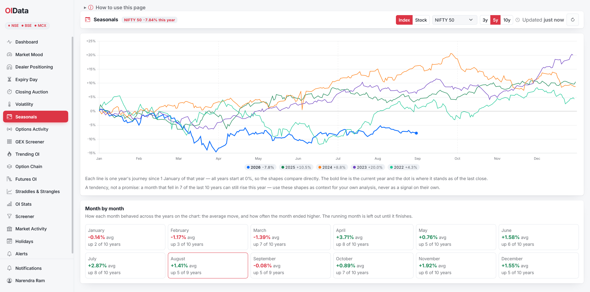
A seasonality chart overlays several years of the same instrument on a single January-to-December axis, with every year restarted at 0% on 1 January. Instead of one long price history, which hides the calendar, you see the shape of each year: where it rose, where it stalled, where it fell. Recurring shapes become visible when the lines stack, and so do the years that broke the pattern. The bold line is the current year, and it ends in a dot that marks where the year stands right now.
The idea is old and general; the standard definition of seasonality is a predictable change that recurs every calendar year. Applied to an index it is a way of asking how the market usually behaves in a given month, with the emphasis on usually.
How each year’s line is built
Every point on a year’s line is the percentage change from the previous year’s closing level. A reading of +5% on 10 March means the index was up 5% since the start of that year. Because every year uses the same rule, the lines are directly comparable: a year that finished at +20% and a year that finished at −8% sit on the same scale, and their shapes can be read against each other. Past sessions use official closes, and since August 2026 that means the closing-auction print that sets the index close, described in the guide to the closing auction session. The current year carries a live point, so the dot moves during the session and locks in after the close.
Reading the month tiles
Under the chart, one tile per month gives two numbers: the average move for that month across the years shown, and how often the month ended higher. A tile that reads avg +3.7%, up 8 of 10 years, describes a month that has usually been strong. A tile that reads avg −1.4%, up 7 of 10 years, describes a month that usually closed higher but fell hard in the years it did fall, which is a different and more useful thing to know. Read the average and the count together; either alone misleads. The running month is left out until it finishes, because a half-finished month would be compared against ten complete ones.
What seasonality cannot tell you
This is the section to read twice. A month that fell in seven of the last ten years can rise this year, and nothing in the chart prevents it. Ten observations is a small sample; one crash or one election can dominate a month’s average for a decade. Seasonality describes tendencies, and tendencies break. Treat the tiles as context for your own analysis, never as a reason to trade on their own. The right question is not “what does March do” but “is this March tracking the usual March, and if not, why not”, which is a question about the present that the chart helps you frame.
Where the patterns come from
Some tendencies have plain causes, and knowing the cause tells you whether to expect it again. The Union Budget lands in February, and the weeks around it carry event risk every year. Quarterly results cluster in specific weeks. Foreign flows have their own year-end and financial-year rhythms, which the FII and DII data makes visible. Expiry cycles put a monthly pulse into index behaviour. Other tendencies have no cause anyone can name, and those are the ones to trust least, because a pattern without a mechanism is the first to disappear.
Seasonality for volatility and stocks
Seasonality is not only for the index. India VIX has its own calendar: the weeks before a budget or an election tend to carry a higher VIX than the weeks after, and a VIX line that is unusually high for the time of year is a fact worth knowing before you sell premium, as discussed in the implied volatility guide. Individual F&O stocks have seasonality too, often tied to their business: results months, festival demand, monsoon exposure. With about 190 names in the F&O list, the stock charts are where the clearest patterns tend to hide, and also where the samples are thinnest, so the caution above applies twice.
A worked reading
The figure shows NIFTY 50 over five years. Four completed years sit between +4% and +20% at year-end, and their shapes agree on a rough rhythm: a soft first quarter, a strong stretch from April into July, a flat September and a firmer close to the year. The bold line is the current year, and it is doing something different: down nearly 15% by early April and still at −7.8% in early September, below every other year on the chart at the same date. The tiles underneath, computed across ten years, say the same thing in numbers. April averages +3.7% and rose in 8 of 10 years; July averages +2.9% and rose in 8 of 10; February and March average negative. The chart does not say the current year will catch up. It says this year has not behaved like the recent ones, which is the useful fact.
Using seasonality with the rest of the data
Seasonality is a background read. It sets expectations for the month; the live data tells you whether those expectations are being met. A month that is usually strong, with the Market Mood Index in fear and open interest building on the call side, is a month where the tendency is being fought, and the fight is the information. Seasonality also sits well with the expiry calendar: a weak-month tendency running into a heavy monthly expiry is worth knowing about a week early, and the expiry-day guide covers the rest.
Where to see it
The Seasonals page draws the chart for NIFTY 50, BANK NIFTY, FIN NIFTY, MIDCAP NIFTY, SENSEX and BANKEX, for India VIX, and for every stock in the NSE F&O list through the search box, with 3, 5 and 10-year windows and the month tiles underneath. Younger indices show the years that exist; MIDCAP NIFTY’s chart begins in 2023, the first year with a full previous-year close to measure from. The current year’s dot updates during market hours.
Seasonality FAQ
What is a seasonality chart? Several years of the same instrument overlaid on one January-to-December axis, each year restarted at 0% on 1 January, so the shape of each year can be compared.
How is each year’s line calculated? Every day’s value is the percentage change from the previous year’s close, so all years share one rule and one scale.
Does seasonality predict this year? No. It describes how a month usually behaved and how often it closed higher. Those tendencies can and do break.
Which symbols have seasonality charts? The six tracked indices, India VIX and every NSE F&O stock, with up to ten years of history each.
Takeaways
- Seasonality overlays calendar years so recurring monthly shapes become visible.
- Read the month tiles as a pair: the average move and how often the month closed higher.
- Ten years is a small sample. A tendency is context, not a forecast.
- Prefer patterns with a known cause: budgets, results seasons, flows, expiries.
- Use it to frame the present: is this year tracking the usual shape, and if not, why not?